Work
TYPE U
A Japanese housing brand, built for an international audience.
Client
Maeda Koumuten
Industry
Residential / Architecture
Location
Ebina, Kanagawa
Year
2025
Role
Web Design / Development / English / Identity / Graphic Design
Project
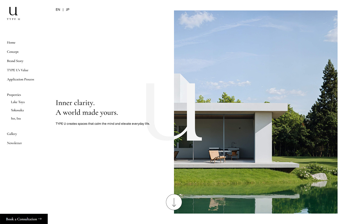
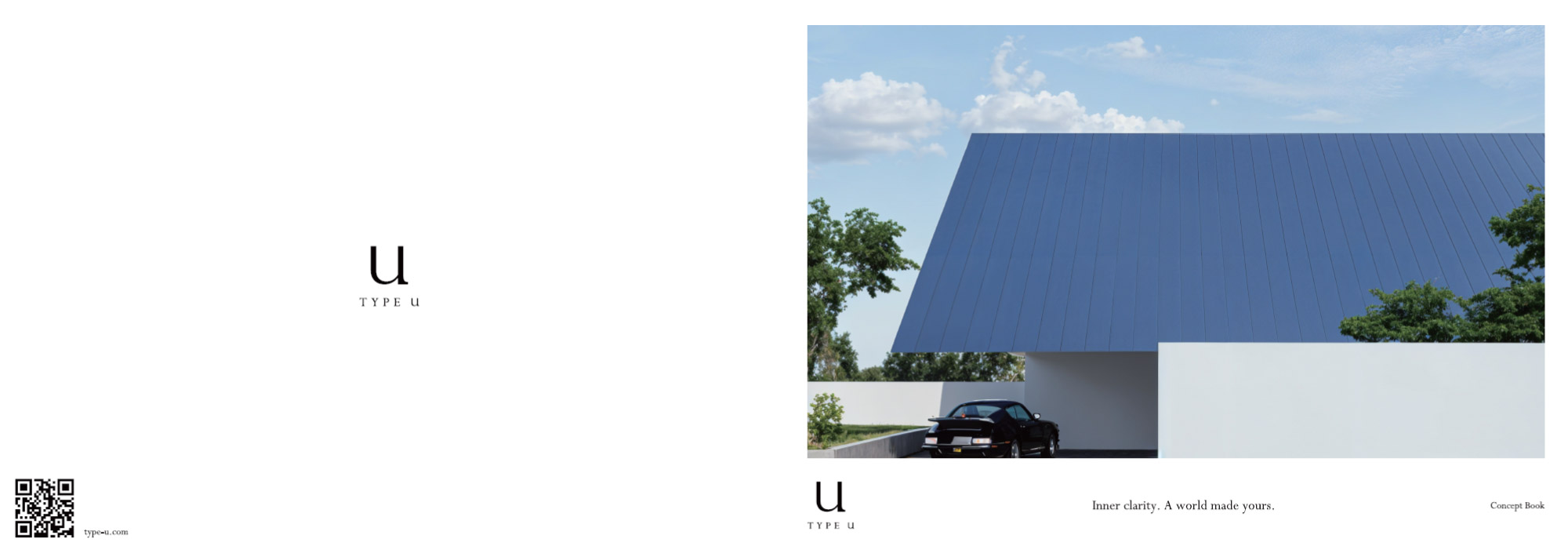
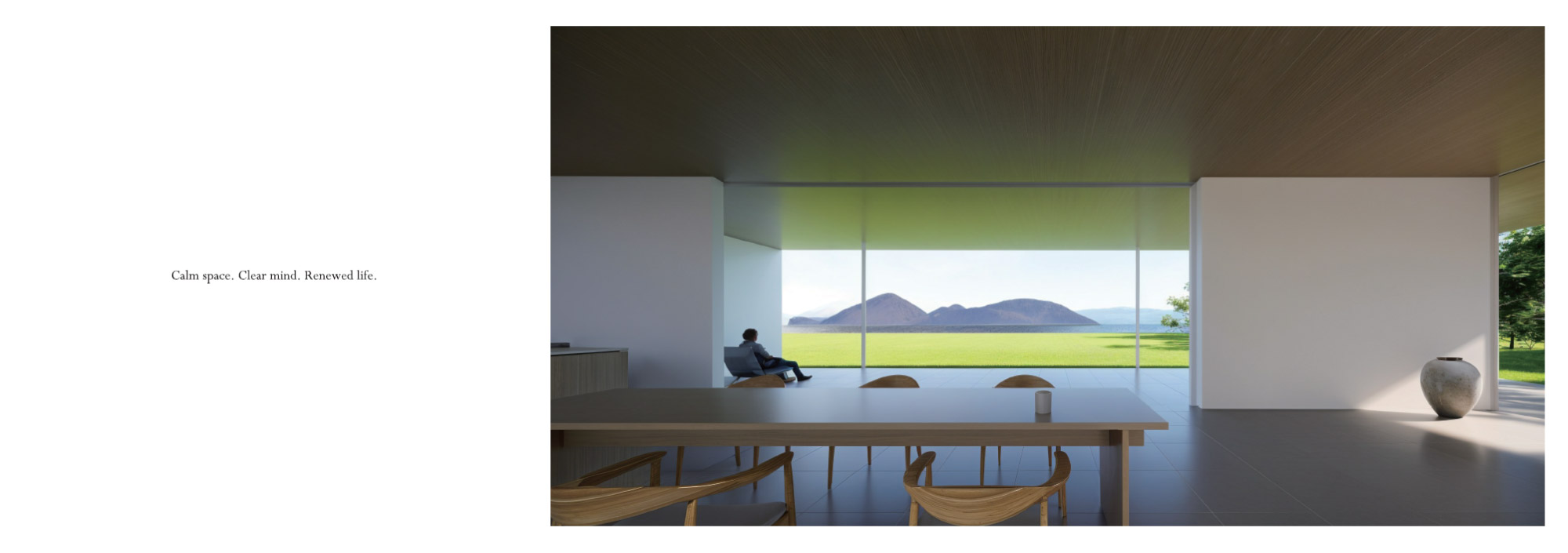
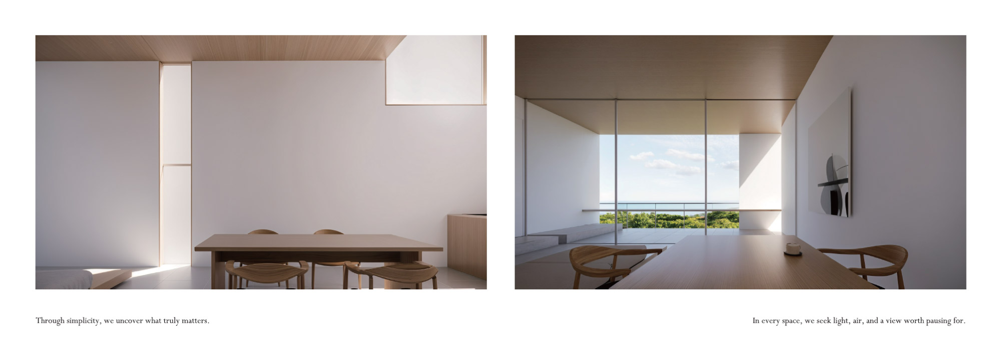
TYPE U is a residential brand created primarily for international clients. BIRTHDeY worked on the identity, English-first bilingual website, English content, event PDFs and concept book. The website was planned around English from the start, with translation and English Review included across the project.
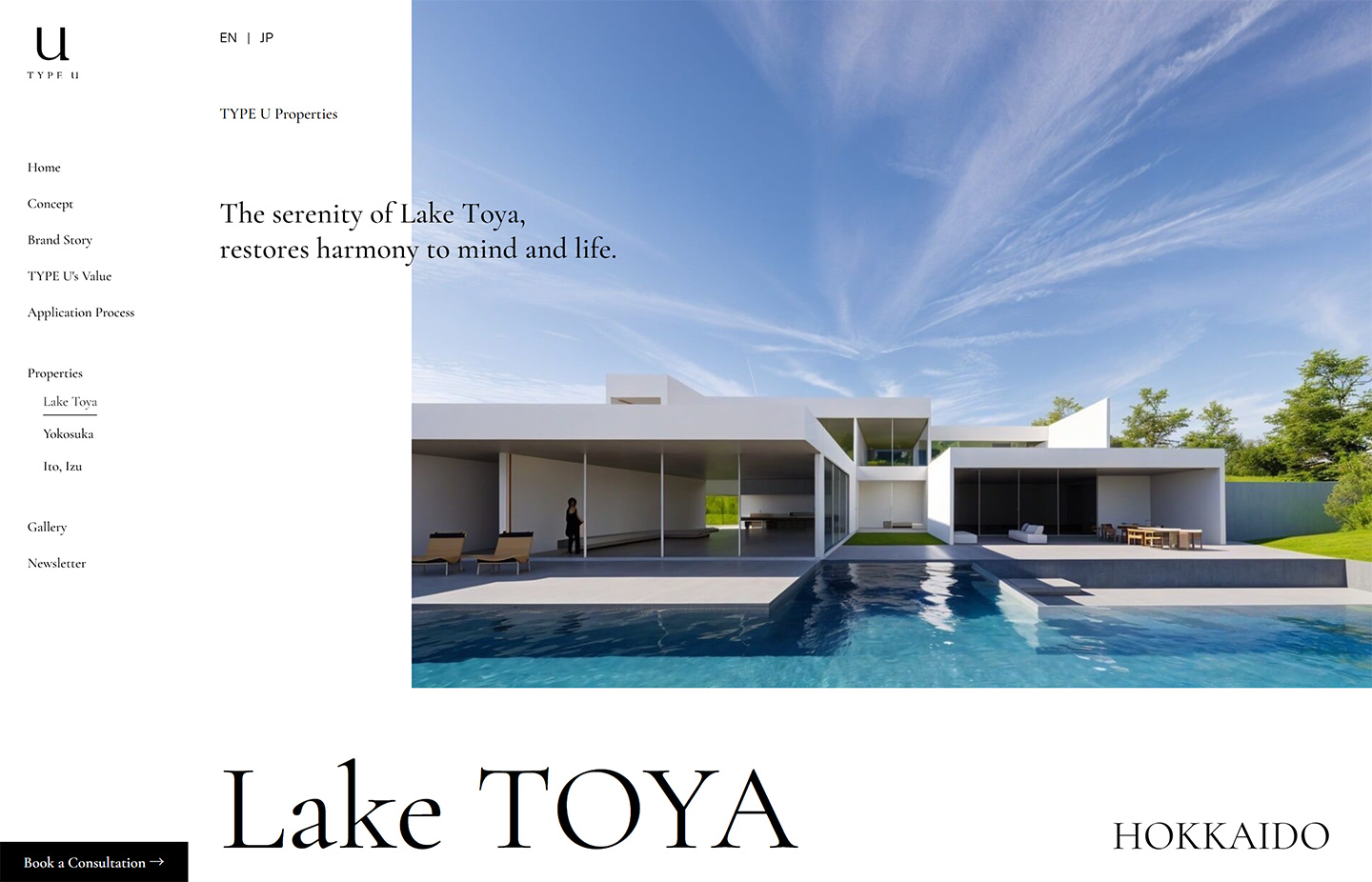
An English-first website
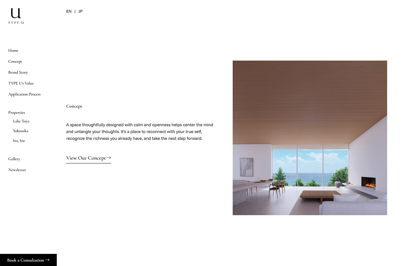
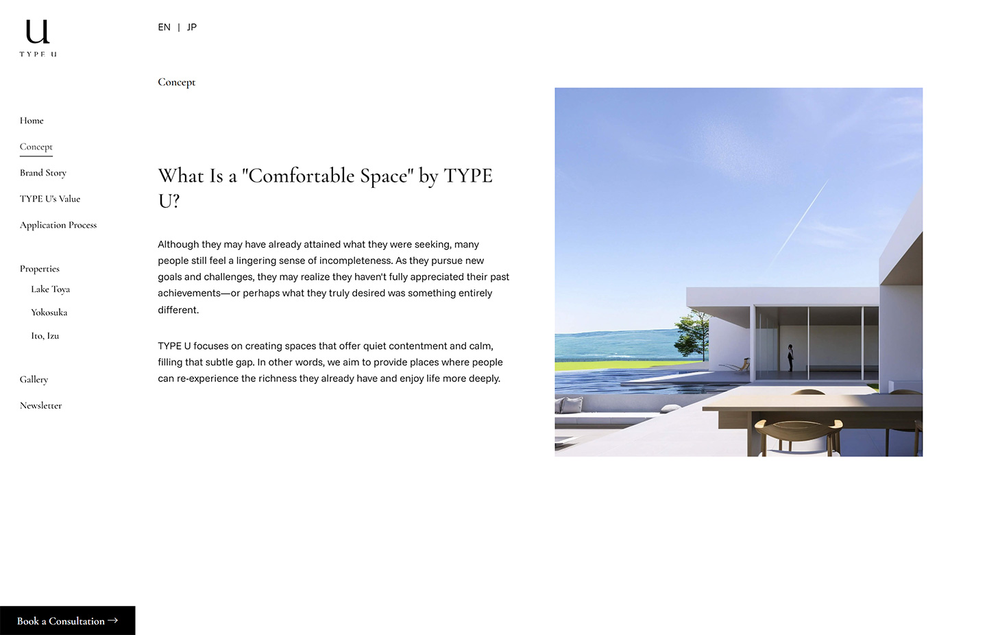
Because the main audience is overseas, the English site was treated as the primary experience rather than an addition to a Japanese site. The structure covers the brand concept, properties and inquiries in a way that can be understood naturally in English.
Explaining the brand through words and visuals
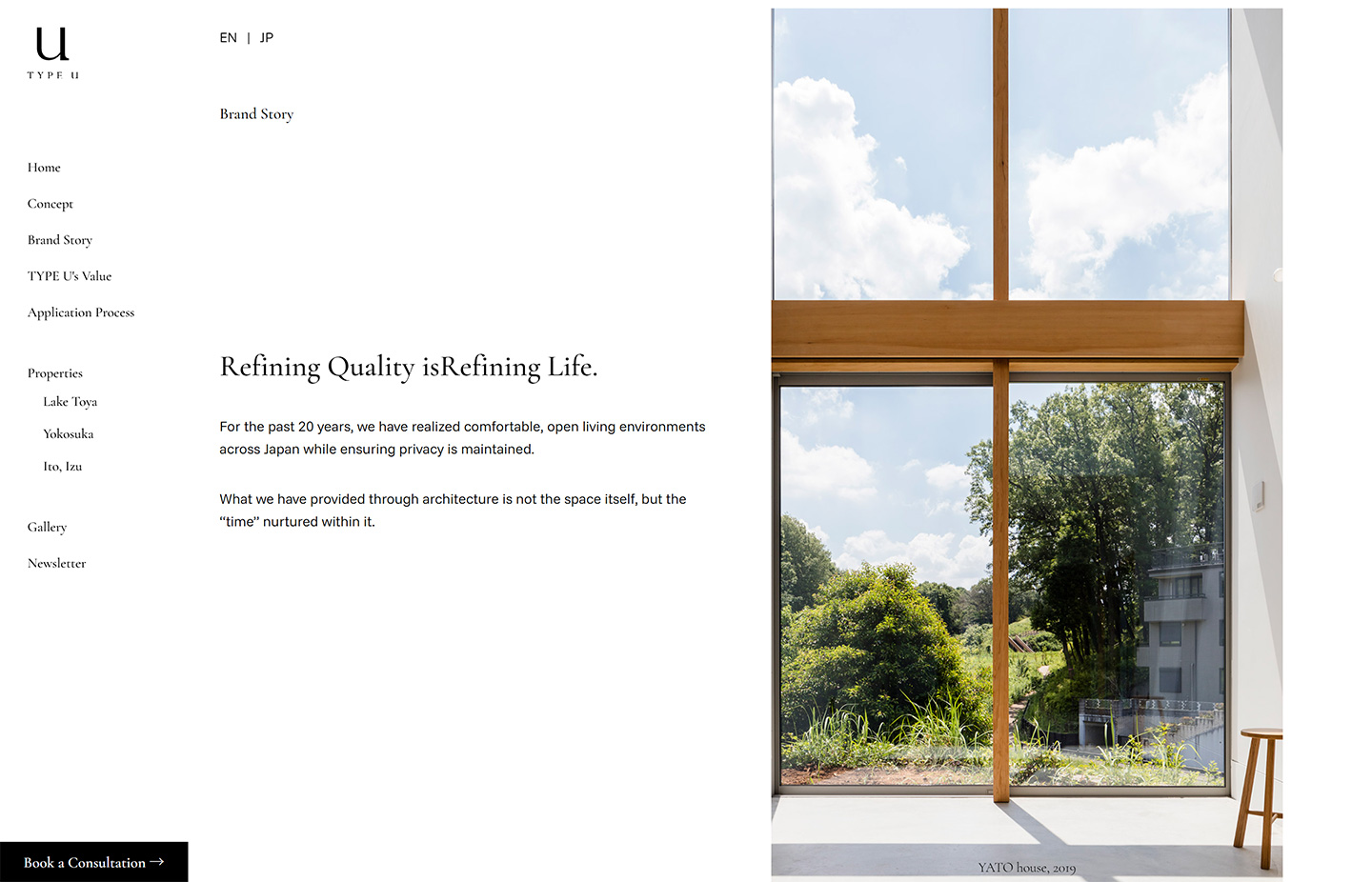
The site needed to communicate not only the homes themselves but the thinking behind them. Large images and longer-form English copy are balanced with different levels of density and rhythm across the pages.
Identity for TYPE U
The TYPE U logo was designed alongside the launch of the brand, with a simple identity that could work consistently across the website and printed materials.
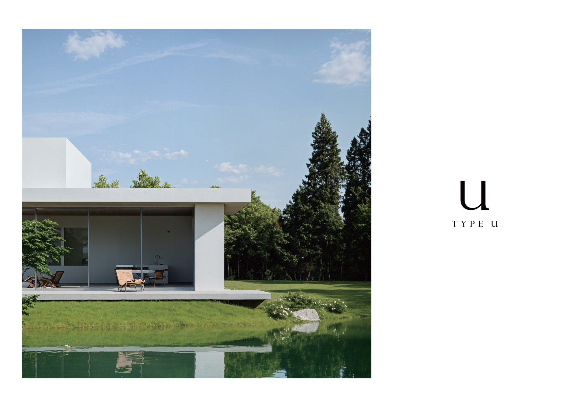
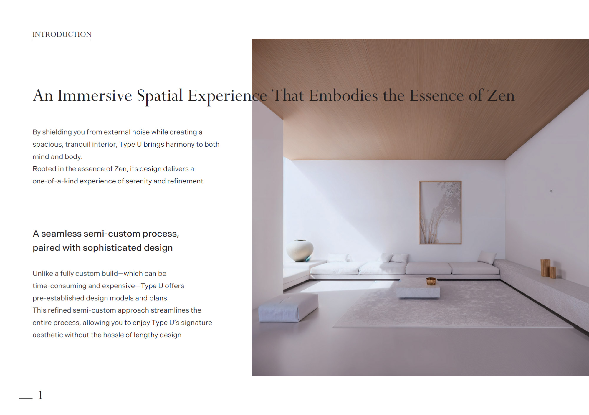
English communication beyond the website
English PDF materials and a concept book were also produced for overseas events, extending the same language and visual tone beyond the website.
Project Info
- Client
- Maeda Koumuten
- Industry
- Residential / Architecture
- Year
- 2025
- Role
- Web Design / Development / English / Identity / Graphic Design
- Location
- Ebina, Kanagawa
Contact
You do not need a finished brief. If you already have a website, send me the URL and a few lines about what you are trying to do in Japan.